Builder
Full product redesign: from a tool nobody used to one teams actually wanted.
Role :
Product designer
Year :
2024–2025
Client :
011h
Project Duration :
6 months

CONTEXT & PROBLEM
Builder is a construction management platform designed to support lean construction workflows. When I joined 011h, Builder already existed — but there was a fundamental problem: it was too complicated to use. Some users literally confessed they preferred to plan manually on paper rather than open the software. For a tool meant to simplify construction work, that was a damning verdict.

DISCOVERY & RESEARCH
To understand why the tool wasn't working, we ran discovery workshops with users, stakeholders, and industry representatives. One of the most revealing exercises was reconstructing the traditional physical planning board used on construction sites — and running the same planning process both manually and digitally, side by side. This allowed us to identify exactly where the digital experience broke down and what users were losing when they switched from paper to software.


Hypothesis
Watching users struggle with digital planning, clear patterns began to emerge. The navigation was confusing, key features were missing, and users consistently lost their way through the product. The tool was supposed to reduce complexity — but it was adding to it instead. Three core problems emerged:
01
Broken workflow
The board was the main workspace - but to add or edit a task, users had to leave it entirely and create entries through a separate form. Two contexts for one action.
02
Chaotic navigation
The board was disorienting. No clear hierarchy, missing key features, and no intuitive way to find what you needed. Users consistently lost their way.
03
Accessibility overlooked
The primary user group was men over 40 - a demographic significantly more prone to colour blindness. The product's colour system made things worse, not better.
NEW ARCHITECTURE
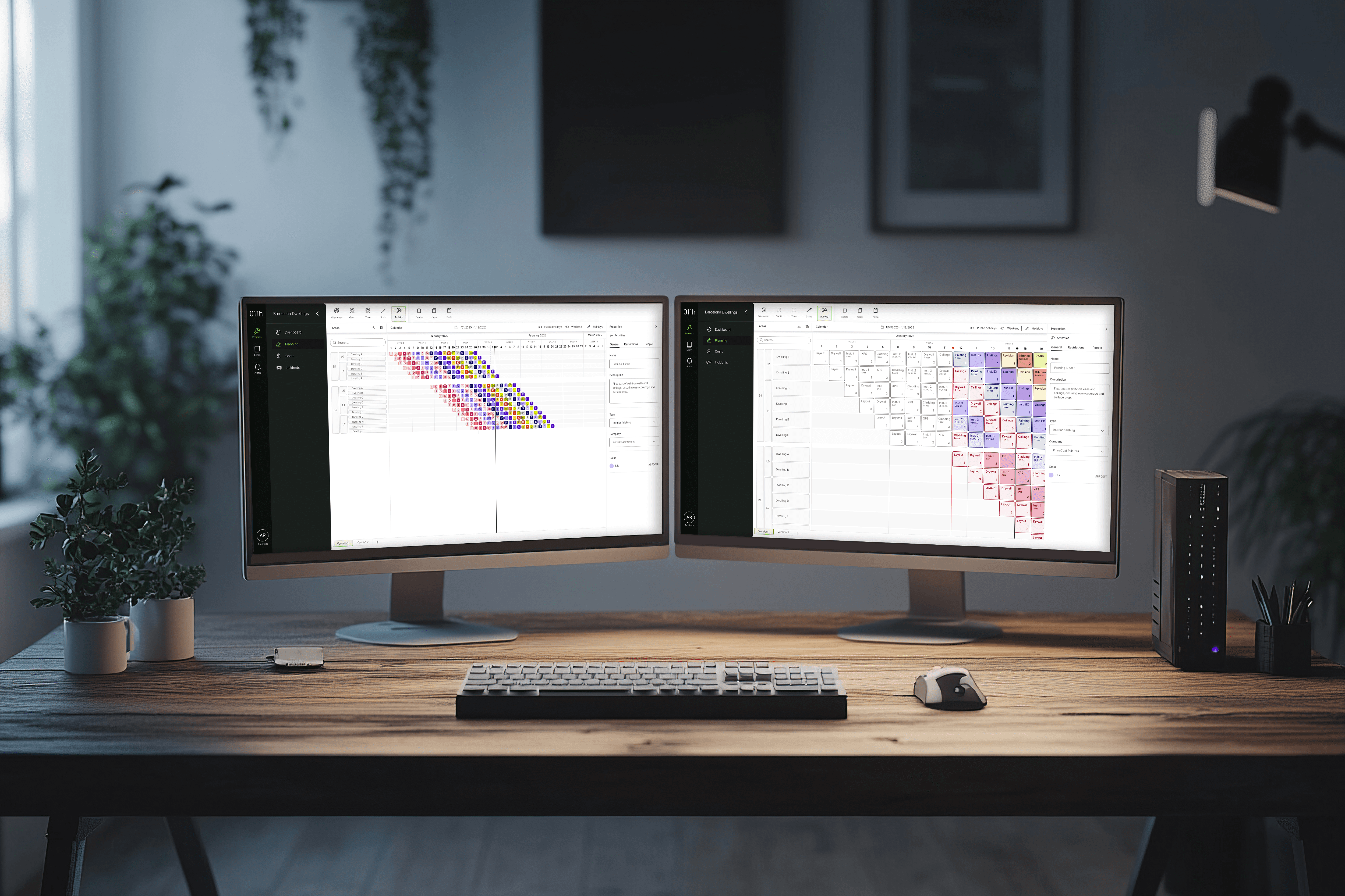
Usability tests confirmed the direction: Builder needed to be restructured, with all actions brought directly onto the board. Simple in principle — but it required rethinking the product's architecture from the ground up. I started by mapping the new board structure, defining how it would behave at different zoom levels, and outlining the main user flows.


QUICK TESTS
To avoid building large changes that wouldn't deliver real improvements, I planned the work in iterations — testing as much as possible with real users along the way. I created two prototypes for A/B testing, comparing overall user experience, task completion rates, and user satisfaction across both versions.
Tests
Test results were encouraging - user feedback was largely positive. However, some elements still weren't working as expected. Users strongly preferred one prototype over the other: its ribbon navigation and overall structure reminded them of Revit and Excel - tools they used every day - making it feel immediately familiar.
To share progress with the team and stakeholders, I mapped the collected feedback directly onto the wireframe, marking elements in red and green to show what was working and what still needed attention.

iteration
After three rounds of testing and iteration, we reached the point where users could complete all tasks with ease — and every pain point we had initially identified was resolved. The architecture was solid and the flows were validated — Builder was finally ready for detailed UI design.

ACCESSIBILITY AND INCLUSIVITY
Our largest user group was men over 40 — a demographic where statistically around 8% are affected by congenital colour blindness, and where age naturally reduces contrast sensitivity.
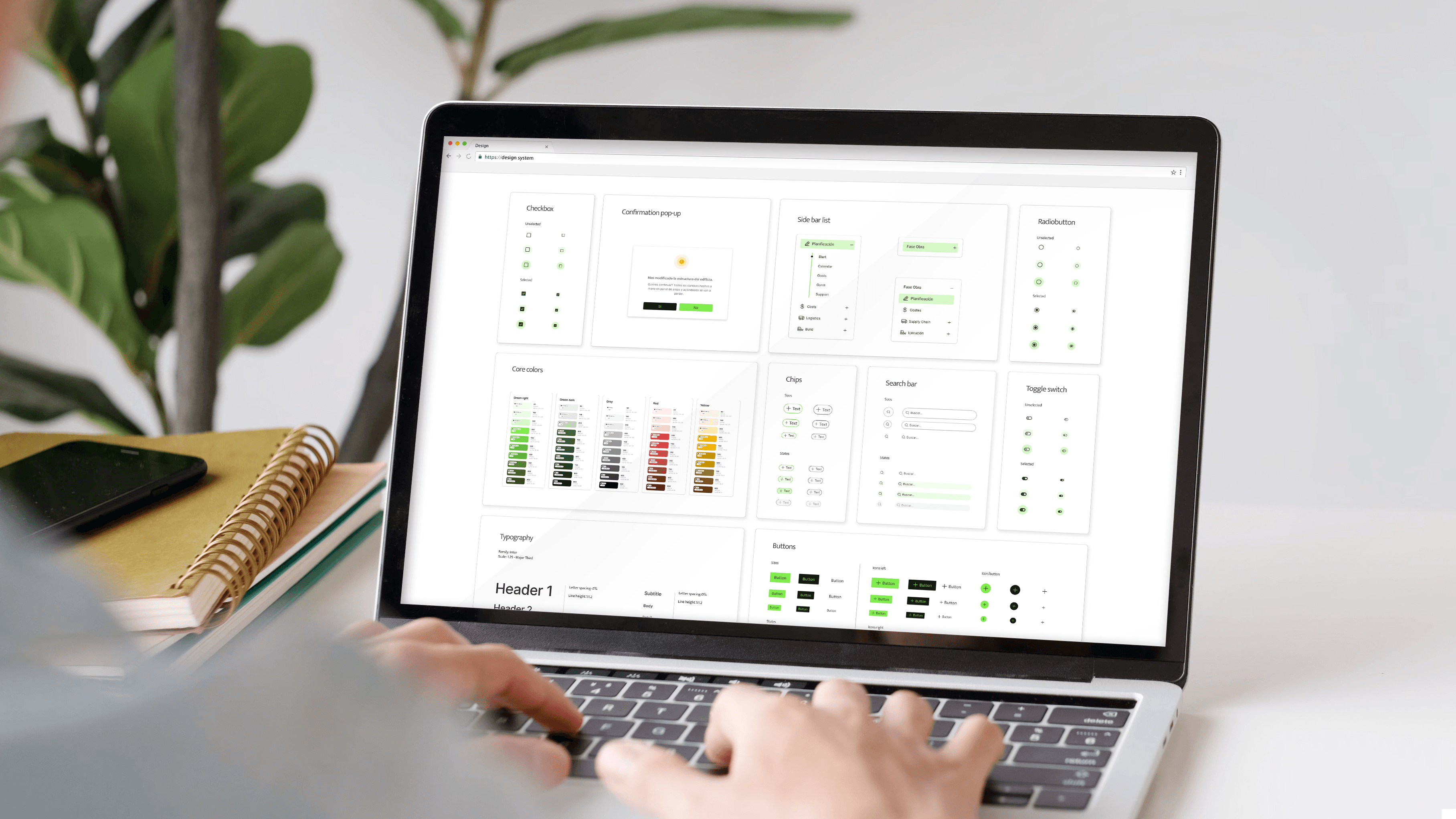
I moved away from relying on colour alone to communicate important information, and implemented a double-encoding principle — combining colour with clear icons and text labels so that meaning was never lost for users who couldn't distinguish hues. I also conducted a full contrast audit using digital tools — and, crucially, validated my proposals directly with two colour-blind members of our construction team, whose feedback shaped the final decisions.


Impact
Usability testing with 6 construction professionals showed measurable improvements across all key metrics - task completion time, success rate, and overall user satisfaction. The redesigned Builder was met with enthusiasm from both users and the wider team.
The product was handed over to development with validated flows and strong user confidence — a solid foundation for the engineering team to build on.
Beyond the product itself, the redesign opened doors to new business partnerships for 011h. And it was just the beginning — with plans already in place to expand Builder's capabilities, including features to support cost estimation workflows.

What I learned
When I first joined the project, the brief was clear: improve the forms and add new features. A focused, contained scope.
But through workshops and usability testing, I was able to bring many people into the process — users, stakeholders, and the wider team. Together, we uncovered problems that went far deeper than the original brief anticipated. The decision was made to pursue a much more fundamental redesign — and the results spoke for themselves.
I'm grateful for this experience, because a proposal for a ground-up redesign doesn't always land well. This time, it did — and it made a real, measurable difference. It reminded me that good research doesn't just inform design. Sometimes, it changes the entire direction of a project.
More Projects

Builder
Full product redesign: from a tool nobody used to one teams actually wanted.
Role :
Product designer
Year :
2024–2025
Client :
011h
Project Duration :
6 months
CONTEXT & PROBLEM
Builder is a construction management platform designed to support lean construction workflows. When I joined 011h, Builder already existed — but there was a fundamental problem: it was too complicated to use. Some users literally confessed they preferred to plan manually on paper rather than open the software. For a tool meant to simplify construction work, that was a damning verdict.
DISCOVERY & RESEARCH
To understand why the tool wasn't working, we ran discovery workshops with users, stakeholders, and industry representatives. One of the most revealing exercises was reconstructing the traditional physical planning board used on construction sites — and running the same planning process both manually and digitally, side by side. This allowed us to identify exactly where the digital experience broke down and what users were losing when they switched from paper to software.
Hypothesis
Watching users struggle with digital planning, clear patterns began to emerge. The navigation was confusing, key features were missing, and users consistently lost their way through the product. The tool was supposed to reduce complexity — but it was adding to it instead. Three core problems emerged:
01
Broken workflow
The board was the main workspace - but to add or edit a task, users had to leave it entirely and create entries through a separate form. Two contexts for one action.
02
Chaotic navigation
The board was disorienting. No clear hierarchy, missing key features, and no intuitive way to find what you needed. Users consistently lost their way.
03
Accessibility overlooked
The primary user group was men over 40 - a demographic significantly more prone to colour blindness. The product's colour system made things worse, not better.
NEW ARCHITECTURE
Usability tests confirmed the direction: Builder needed to be restructured, with all actions brought directly onto the board. Simple in principle — but it required rethinking the product's architecture from the ground up. I started by mapping the new board structure, defining how it would behave at different zoom levels, and outlining the main user flows.
QUICK TESTS
To avoid building large changes that wouldn't deliver real improvements, I planned the work in iterations — testing as much as possible with real users along the way. I created two prototypes for A/B testing, comparing overall user experience, task completion rates, and user satisfaction across both versions.
Tests
Test results were encouraging - user feedback was largely positive. However, some elements still weren't working as expected. Users strongly preferred one prototype over the other: its ribbon navigation and overall structure reminded them of Revit and Excel - tools they used every day - making it feel immediately familiar.
To share progress with the team and stakeholders, I mapped the collected feedback directly onto the wireframe, marking elements in red and green to show what was working and what still needed attention.
iteration
After three rounds of testing and iteration, we reached the point where users could complete all tasks with ease — and every pain point we had initially identified was resolved. The architecture was solid and the flows were validated — Builder was finally ready for detailed UI design.
ACCESSIBILITY AND INCLUSIVITY
Our largest user group was men over 40 — a demographic where statistically around 8% are affected by congenital colour blindness, and where age naturally reduces contrast sensitivity.
I moved away from relying on colour alone to communicate important information, and implemented a double-encoding principle — combining colour with clear icons and text labels so that meaning was never lost for users who couldn't distinguish hues. I also conducted a full contrast audit using digital tools — and, crucially, validated my proposals directly with two colour-blind members of our construction team, whose feedback shaped the final decisions.
Impact
Usability testing with 6 construction professionals showed measurable improvements across all key metrics - task completion time, success rate, and overall user satisfaction. The redesigned Builder was met with enthusiasm from both users and the wider team.
The product was handed over to development with validated flows and strong user confidence — a solid foundation for the engineering team to build on.
Beyond the product itself, the redesign opened doors to new business partnerships for 011h. And it was just the beginning — with plans already in place to expand Builder's capabilities, including features to support cost estimation workflows.
What I learned
When I first joined the project, the brief was clear: improve the forms and add new features. A focused, contained scope.
But through workshops and usability testing, I was able to bring many people into the process — users, stakeholders, and the wider team. Together, we uncovered problems that went far deeper than the original brief anticipated. The decision was made to pursue a much more fundamental redesign — and the results spoke for themselves.
I'm grateful for this experience, because a proposal for a ground-up redesign doesn't always land well. This time, it did — and it made a real, measurable difference. It reminded me that good research doesn't just inform design. Sometimes, it changes the entire direction of a project.
More Projects
Builder
Full product redesign: from a tool nobody used to one teams actually wanted.
Role :
Product designer
Year :
2024–2025
Client :
011h
Project Duration :
6 months
CONTEXT & PROBLEM
Builder is a construction management platform designed to support lean construction workflows. When I joined 011h, Builder already existed — but there was a fundamental problem: it was too complicated to use. Some users literally confessed they preferred to plan manually on paper rather than open the software. For a tool meant to simplify construction work, that was a damning verdict.
DISCOVERY & RESEARCH
To understand why the tool wasn't working, we ran discovery workshops with users, stakeholders, and industry representatives. One of the most revealing exercises was reconstructing the traditional physical planning board used on construction sites — and running the same planning process both manually and digitally, side by side. This allowed us to identify exactly where the digital experience broke down and what users were losing when they switched from paper to software.
Hypothesis
Watching users struggle with digital planning, clear patterns began to emerge. The navigation was confusing, key features were missing, and users consistently lost their way through the product. The tool was supposed to reduce complexity — but it was adding to it instead. Three core problems emerged:
01
Broken workflow
The board was the main workspace - but to add or edit a task, users had to leave it entirely and create entries through a separate form. Two contexts for one action.
02
Chaotic navigation
The board was disorienting. No clear hierarchy, missing key features, and no intuitive way to find what you needed. Users consistently lost their way.
03
Accessibility overlooked
The primary user group was men over 40 - a demographic significantly more prone to colour blindness. The product's colour system made things worse, not better.
NEW ARCHITECTURE
Usability tests confirmed the direction: Builder needed to be restructured, with all actions brought directly onto the board. Simple in principle — but it required rethinking the product's architecture from the ground up. I started by mapping the new board structure, defining how it would behave at different zoom levels, and outlining the main user flows.
QUICK TESTS
To avoid building large changes that wouldn't deliver real improvements, I planned the work in iterations — testing as much as possible with real users along the way. I created two prototypes for A/B testing, comparing overall user experience, task completion rates, and user satisfaction across both versions.
Tests
Test results were encouraging - user feedback was largely positive. However, some elements still weren't working as expected. Users strongly preferred one prototype over the other: its ribbon navigation and overall structure reminded them of Revit and Excel - tools they used every day - making it feel immediately familiar.
To share progress with the team and stakeholders, I mapped the collected feedback directly onto the wireframe, marking elements in red and green to show what was working and what still needed attention.
iteration
After three rounds of testing and iteration, we reached the point where users could complete all tasks with ease — and every pain point we had initially identified was resolved. The architecture was solid and the flows were validated — Builder was finally ready for detailed UI design.
ACCESSIBILITY AND INCLUSIVITY
Our largest user group was men over 40 — a demographic where statistically around 8% are affected by congenital colour blindness, and where age naturally reduces contrast sensitivity.
I moved away from relying on colour alone to communicate important information, and implemented a double-encoding principle — combining colour with clear icons and text labels so that meaning was never lost for users who couldn't distinguish hues. I also conducted a full contrast audit using digital tools — and, crucially, validated my proposals directly with two colour-blind members of our construction team, whose feedback shaped the final decisions.
Impact
Usability testing with 6 construction professionals showed measurable improvements across all key metrics - task completion time, success rate, and overall user satisfaction. The redesigned Builder was met with enthusiasm from both users and the wider team.
The product was handed over to development with validated flows and strong user confidence — a solid foundation for the engineering team to build on.
Beyond the product itself, the redesign opened doors to new business partnerships for 011h. And it was just the beginning — with plans already in place to expand Builder's capabilities, including features to support cost estimation workflows.
What I learned
When I first joined the project, the brief was clear: improve the forms and add new features. A focused, contained scope.
But through workshops and usability testing, I was able to bring many people into the process — users, stakeholders, and the wider team. Together, we uncovered problems that went far deeper than the original brief anticipated. The decision was made to pursue a much more fundamental redesign — and the results spoke for themselves.
I'm grateful for this experience, because a proposal for a ground-up redesign doesn't always land well. This time, it did — and it made a real, measurable difference. It reminded me that good research doesn't just inform design. Sometimes, it changes the entire direction of a project.